PERFORMANCE WEBSITES, DIGITAL STRATEGY
Digital Health Check #2: The Importance of Mobile Friendliness
With 4 billion mobile phones in use globally, having a mobile-friendly website has never been more important. As well as visually improving the design, recent studies have shown that users prefer to use mobile as their primary browser. As such, it seems that mobile friendliness will not only improve the shopping experience for your potential customers and clients, but it could also help boost your conversions and improve your web traffic.
What is a ‘Mobile Friendly’ Website?
A mobile-friendly website displays an adapted version of the design on hand-held devices such as smartphones and tablets. As well as having an improved visual design, mobile friendly websites will also load faster and be clearer for readers to view.
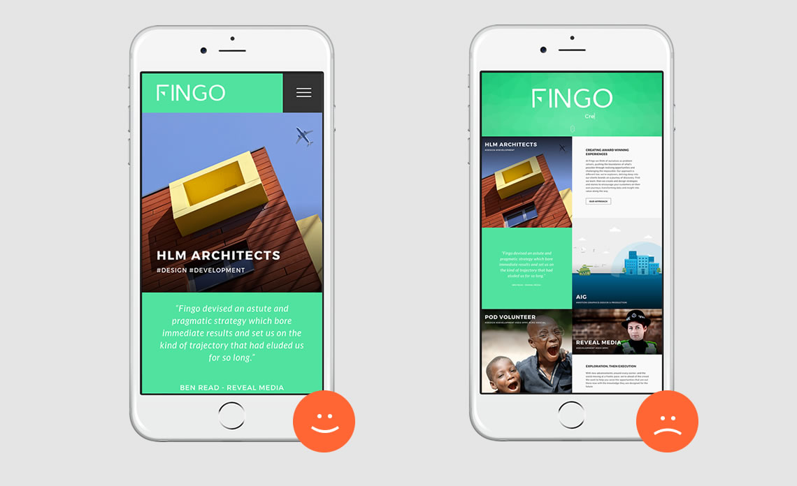
Is My Site Mobile-Friendly?
Checking your site for mobile-friendliness is a quick and simple process. To check whether your website is mobile friendly, just copy your website URL in to this free tool.
If your website is not mobile-friendly, you may wish to review the reasons below to see how it will improve your business site.
Google Favours User Experience
Whilst Google will not penalize your website for not being mobile-friendly, they do favour websites that cater to user experience. Since mobile-friendly websites often have quicker loading times and are much easier for browsers to read, this is deemed to be preferred by Google. As such, these will take priority over non-mobile friendly sites which could affect your business.
For example, if your site is not mobile-friendly but your competitor’s site is, it is likely that they will rank higher in the SERPs. And as we know – higher rankings means higher visibility which means more business enquiries and potential sales.
Local SEO
Did you know that more than 88% of local searches are carried out on smart devices? Recent studies have shown that Local SEO, in particular, provides a higher ROI than traditional advertisements. As such, it is a more favourable choice for small to medium businesses. In an article published by SEMrush, Local SEO has evolved in recent years meaning it is becoming more a mobile focused method. And so, if you want to stay ahead, a mobile-friendly design is key.
The Social Network
As we know already, social media is an effective way of boosting your business online. Various platforms can be used promote products, content and general day-to-day updates. Ultimately, the goal is to encourage traffic through to your website. In doing so, you want to ensure that users can click through to the site with ease without feeling the need to click away from the site without completing their transaction. With a third of Facebook’s 700 million users using Facebook Mobile, and half of twitter’s 175 million users are using Twitter Mobile, we needn’t say more.
Unplayable Content
In some cases, not all content is viewable on mobile-view. As such, Google will issue a message to the user to view it instead on a desktop. Realistically, users are most likely to leave it entirely. So if you’ve spent hours on video marketing or content creation but your website is not mobile-friendly, it could all be in vein. The key, of course, is to ensure that the user has access to all content no matter what device they’re using and, as a business, to be providing the best customer experience as possible.
To find out more on how to make your website more mobile-friendly or if you have any questions from today’s post, you can get in touch via our contact page or email us at hello@fingo.co.uk.